We went on a trip to Gallery44, We learned how to make pinhole camera's and got to shoot some photos. It didn't take long to make the camera but the shooting part of it is kind of hard.
We used light sensative paper, and got to go in the back parking lot of the building and get some flicks. Here are just a few of the ones that i took, but the bottom two are from places that are near our school yard.
On the trip i learned how to create a pinhole camera and use it, and develop the pictures.
It was a very fun trip, We had a fun time and i hopefully wish to go again.
Pinhole photography is about taking pictures and developing them in the chemicals.
It is a very time consuming process and takes alot of patience, but in the end.. It looks GREAT!
Some pinhole photographers make theyre own cameras out of they're paper so it gets into some funky shapes.
Friday, January 9, 2009
Tuesday, December 9, 2008
Opyical illusion's
I chose to write about the Chromatrope because the website with it on it was very informative about this optical illusion. It turns out that optical illusion toys and stuff have been around way before i could of though. My favorite one would have to be the Chromatrope because i have known of it since i was a little kid and according to my parents, i loved it. When you look through it, it gives a trippy vision, like looking through a fisheye lens, it distorts the image. I though that people back then would not of though of this idea for the Chromatrope, but turns out they were alot smarter then i though.
Here is a link to the website so you can read a bit more on the Chromatrope.
http://courses.ncssm.edu/gallery/collections/toys/html/exhibit04.htm
Friday, November 7, 2008
Pinhole photography artist
The website I have come across is made by a man named Thomas Hudson Reeve. He is a pinhole camera artist. He is one of the artists that fold origami camera's to take his picture over the whole camera and it gives it a really cool effect. I find it really interesting that he is able to get photos like these ones.. http://www.papercams.com/gallery/photos.html
Light and Shadow
linear perspective
Framing
Focal Point
I decided to take this picture because it uses the aspect of focal point. Your eye is automatically drawn to the garbage can and to the middle of the two concrete lines. It enhances all of the textures of the objexts in the photo. I think that this picture is really simple because there are no extreme angles or dynamics. This photo also uses the element of simplicity too.
Photography lines
P.D.N article
I did my post on a company called Red shocked the Digital Video. When the company first started out they were not that big at all, and not being noticed by anyone. As the years went by they started doing more artwork and attending more shows and got know more and now are a really big company.
The company announced several new devices, including the red Scarlet and a new Epic. The company released preview's of new products and the new Digital SLR combined with a digital video camera.
The company Red is announcing that on November 13th we will see a final preview of the new products, which were re-designed.
LOGO
My design company is called 6 graphic inc. It is an independent company that does big projects like billboards, or can be small like business cards. The wolf is the perfect animal to describe our company. The wolf represents leadership and independancy.
I didn't really go with the typical Grey and white wolf, i decided to choose red as the main color. The lines that i used are pretty sold and give a good outline of the wolf. My black and white one is easy to see where the lines are and you can see the difference's quite easy.
My logo in my opinion represents my company very well and I think i used the principles of designs properly.
Graphic Design link
Here is the graphic design link i chose because it shows a lot of different types of graphic design. It shows that really, you can take any ordinary picture and totally bring it to life by adding some graphic design. It shows what you can do with your mind if you really try.
Wednesday, October 15, 2008
Photography
Timing the Decisive Moment
When taking a picture, timing is a very large element. If it is a photo of a moving subject you want to capture it in an action where it will make the photo "exciting". An animal jumping or a human taking action can add a lot of quality to the photo. If you are taking a picture of a sport you need to take the photo when something is happening, i.e. a basketball player going in for a dunk, or a slap shot in hockey.
http://farm3.static.flickr.com/2085/2083505315_98a94eb17e.jpg = bird taking off
http://www.fincalasbrisas.org/pictures%20creatures/Jesus%20Christ%20Lizard.jpg = lizard
By: Tylyr L, and Dawson B
Photography
Center of Interest
The center of interest is the point in a photo where your eye is automatically drawn to. It is the focus of the picture and is where the photographer wants you to look. This can be reflected or presented by using objects that stand out or making a strong foreground next to an expanding background.
http://www.dcmag.co.uk/fx/4a512627/countryside.img?iwidth=651 = house
http://farm2.static.flickr.com/1051/574379846_e79e059d3c.jpg = a look through bolt down railroad tracks
By: Tylyr l, and Dawson B
Wednesday, October 1, 2008
Our teacher gave us an assignment to draw a random chess piece with value. I luckily got the rook out of the box so it didn't seem hard at first. I chose to try to make movement in the background by adding various bubbles, in different shades. I think it kinda looks like the chess piece is floating in water or falling down or something. Over all i think that it turned out pretty well, but i pushed to hard on the really dark bubbles, so it turned out shiny, so i learned not to push so hard but to layer which will give a better look then the shiny effect. Well thats basically it, il post some new stuff later on this week or next week.
Thanks
Thursday, September 18, 2008
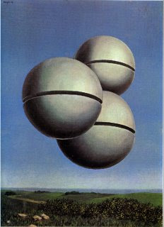
Rene Magritte- Voice of the Winds
The piece of art I chose to write about is called Voice of the Winds by Rene Magritte.
This piece is realistic because he made a picture of landscape but added those three floating sphere's. He added alot of detail on the plants, horizon and the sky.
I feel that there is a Energetic mood to this painting because of the colors such as light Green's, light Blue's,and light Grey's. They are all lighter colors so it makes people feel relaxed because if they were darker colors they would make some people feel more tense.
There is a empty field with nothing on it except a few trees which makes people feel relaxed because it is like they are getting away from everything and just get to lie down with a breeze over them.
This piece looks like there might have been some texture on the plants if it were an oil painting, but it is a watercolor so there is no texture. The space on the picture looks evenly balanced, so there is not alot of room left with nothing in that area. The painting uses a variety of Green's, Blue's, and Grey's and some Brown's. He did a good job blending the colors and making everything flow very smoothly.
Here is a quote once said by Rene Magritte
My painting is visible images which conceal nothing... they evoke mystery and indeed when one sees one of my pictures, one asks oneself this simple question 'What does that mean'? It does not mean anything, because mystery means nothing either, it is unknowable.”
Subscribe to:
Posts (Atom)